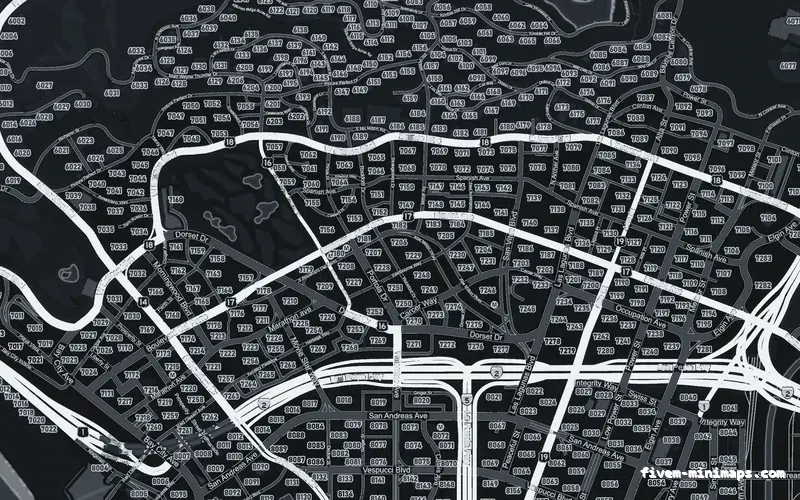
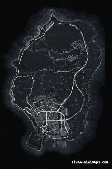
 Google style
GrayGRAPHITE
The Google-style base in a neutral palette: the most realistic map in the set.
6144 × 9216 px · 78 files · google style$8.00+ $1 / elementView
Realistic, on a minimap, does not mean a satellite photo. Satellite maps are the least readable thing you can put in the corner of a screen — every roof, every tree, every car park competing with the blips. Realistic means what a navigation app means by it: the roads sorted into tiers so a highway reads differently from a lane, terrain shading so hills look like hills, a coastline with actual depth, and nothing on the map that does not help the player. That is how every map here is built, and it is why the clean ones look modern rather than empty.
Three concrete recommendations rather than a shrug — with the reason attached.
Google styleThe Google-style base in a neutral palette: the most realistic map in the set.
6144 × 9216 px · 78 files · google style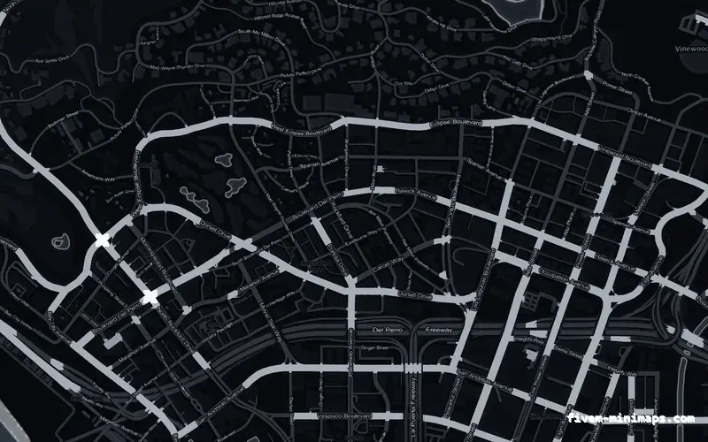
 No postals
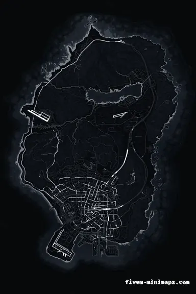
Minimalist and dark — three road tiers and the coastline, nothing else.
6144 × 9216 px · 78 files · without postal codes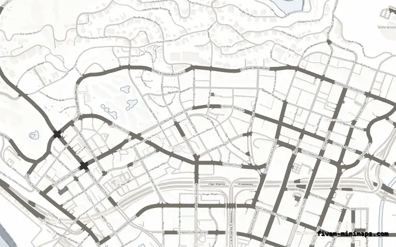
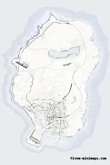 No postals
A clean paper-white map for a modern, light HUD.
6144 × 9216 px · 78 files · without postal codesHierarchy. Real maps draw a motorway wider and brighter than a residential street, and the eye uses that to read a city at a glance. Every map here separates the road network into three tiers from the actual geometry — trunk routes, main roads, local streets — each with its own width and weight, tuned per palette so that the trunk stays visible without glaring. Most free maps draw every road the same, which is why they look flat.
Relief. The terrain is shaded from a directional light so that the Vinewood hills, the Chiliad range and the quarry read as landforms rather than colour patches. Below the waterline the coast has bathymetric depth contours, so the sea is not a single flat fill. These are subtle on the radar and obvious on the pause map, which is where players stop and look.
The no-postals map is the minimalist option: street names only, no numbered grid, nothing printed on the ground that is not a road, a coast or a name. It is the map most often described as "clean" by the people who buy it, and it is the natural ground for servers that draw their own zones, territories and blips on top — nothing in the art competes with what your scripts add.
In the dark palettes — obsidian, graphite, cobalt — it reads as a modern dashboard map. In white it looks like a printed city plan. Either way the identity comes from the palette and, if you add one, your logo, rather than from decoration.
The maps that look best in a screenshot are often the worst in play, because the screenshot is taken zoomed out on the pause menu and the game is played on a radar the size of a coaster. Every palette here is tuned at radar size first: the ground is quiet enough for saturated blips to land on it, the accent colour is kept away from the alert colours the HUD uses, and the road contrast is high enough to follow at speed without being a neon sign.
Then it is checked on the pause map, where the relief and the coastline do their work. The live preview shows both — zoom in to see what the radar sees, zoom out for the pause map.
A serious roleplay server wants a map that looks professional and gets out of the way. The realistic bases do that, and they leave room for the things a serious server adds: a dispatch postal grid if you run one, your own district tint, your server name in a corner. The NoPixel-style page covers the specific look those servers converge on; this page is the wider set of options behind it.
Open the live preview and look at any street on any theme before you spend a cent.