 No postals
WhiteALABASTER
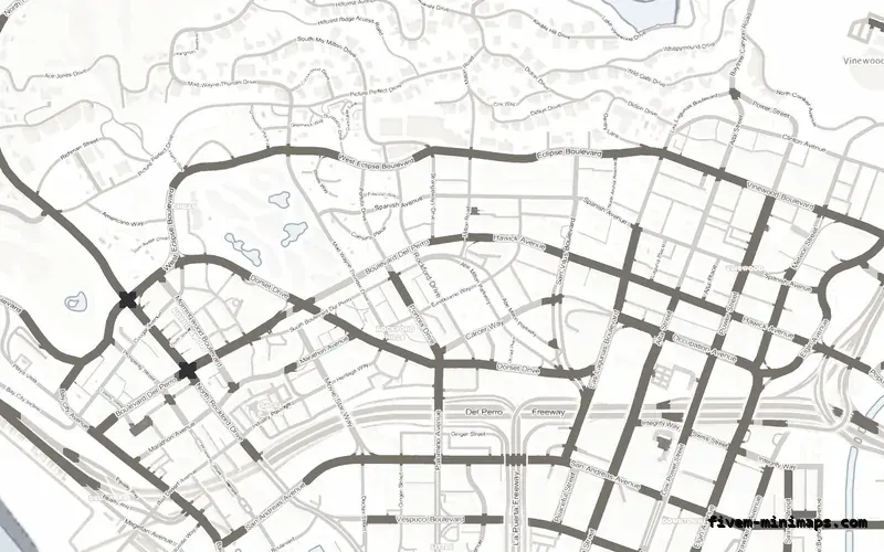
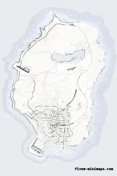
The purest version: paper ground, dark roads, nothing else.
6144 × 9216 px · 78 files · without postal codes$8.00+ $1 / elementView
Almost every custom minimap sold for FiveM is dark, and most of the reasons for that are good ones. But a light map is not a mistake, it is a trade: you give up some blip contrast and gain type legibility, detail and a look that almost nobody else on the server list is running. This page is about when that trade is worth making.
Three concrete recommendations rather than a shrug — with the reason attached.
No postalsThe purest version: paper ground, dark roads, nothing else.
6144 × 9216 px · 78 files · without postal codes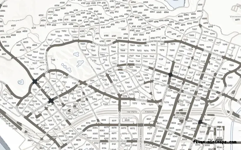
 Postal codes
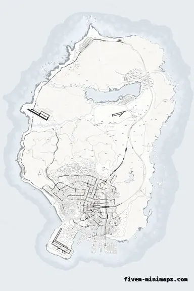
The same ground with postal numbers, which read better on light than on dark.
6144 × 9216 px · 78 files · with postal codes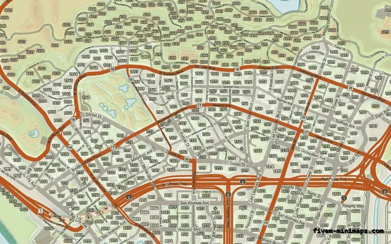
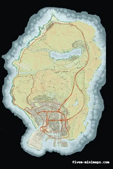 Google style
Light without being white — colour landuse on a pale base.
6144 × 9216 px · 78 files · google styleType. Dark letters on a light ground is the arrangement every printed map and every road sign uses, because it is what human vision handles best. Street names and postal numbers are noticeably easier to read on the alabaster map than on any of the dark ones, and that gap widens the smaller the type gets.
Detail, second. A light ground has more room above it for the road tiers to separate, so a light map can show three road levels, a coastline, terrain shading and names without any of them fighting. On a dark map the same layers have to share a narrower band of brightness.
And distinctiveness, third. A server list full of black maps makes a paper map memorable, and it photographs well — a light pause map in a Discord screenshot reads as considered rather than as the default everyone installs.
Blip contrast, first and most importantly. Game blips are saturated colours designed to sit on the stock map, which is mid-grey; on a near-white ground the pale ones — white, yellow, light blue — lose some of their separation. If your server depends on spotting one blip among many, this is the argument for staying dark.
Glare, second. A bright rectangle in the corner of the screen during a night scene is exactly as distracting as it sounds, and roleplay servers run a lot of night. Players with a dim monitor will love it; players in a dark room at 3 am will not.
HUD collisions, third. A great many FiveM HUDs draw white text, white bars and white icons, all of which were designed on the assumption that the map behind them is dark. A light map turns those invisible, and the fix is a HUD change rather than a map change.
Alabaster is the white one: a paper ground, dark road casing, and the highest type legibility in the collection. It is available on all three base styles, so you can have it with postal numbers, with street names only, or as part of the colour street map.
Topo day is light without being white — a full atlas in daylight colours, with sage and wheat ground, red freeways and contour lines. It keeps most of the legibility benefit while giving the eye something other than white to land on, which is why it is the more common choice for servers that want light but run a lot of night.
Graphite sits in the middle and is the compromise pick. It is a mid-grey ground rather than a dark one, so blips still read and white HUD text still works, but it is noticeably lighter and calmer than obsidian.
Servers whose identity is clean and bright: economy and civilian roleplay, city builders, servers with a light HUD, anything where the map gets read rather than glanced at. Dispatch-heavy police servers and redzone servers are the two places a light map genuinely loses, because both are decided by how quickly a player finds one icon.
The other good case is a pause map that gets used for planning. If your players are routinely opening the full map to work something out — a route, a territory, a property — the light map is the easier one to think on.
Open the live preview and look at any street on any theme before you spend a cent.