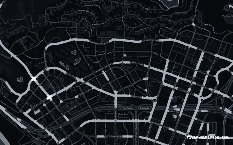
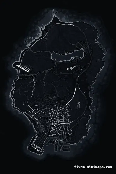
 No postals
BlackOBSIDIAN
Where most servers land when they answer the questions honestly.
6144 × 9216 px · 78 files · without postal codes$8.00+ $1 / elementView
Thirty-six maps is too many to choose from by looking at them, and looking at them is the worst way to choose anyway — a product image is a full-colour map at full size, which is the one context a minimap is never used in. This page is the other approach: five questions about your server, each of which eliminates a chunk of the collection, ending with two or three maps rather than thirty-six.
Three concrete recommendations rather than a shrug — with the reason attached.
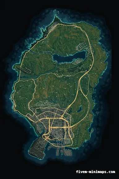
No postalsWhere most servers land when they answer the questions honestly.
6144 × 9216 px · 78 files · without postal codes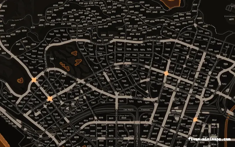
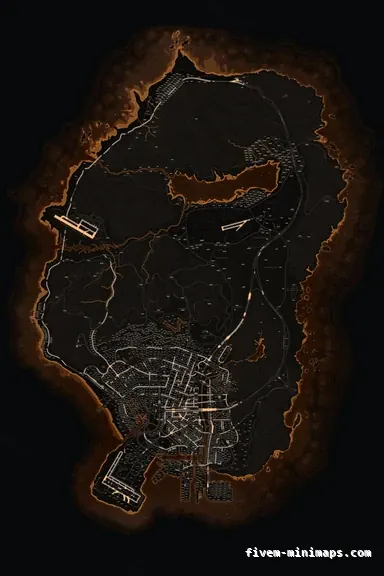 Postal codes
The common answer for dispatch-driven roleplay with a warm identity.
6144 × 9216 px · 78 files · with postal codes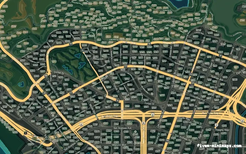
 Google style
The answer when the terrain and the detail genuinely matter.
6144 × 9216 px · 78 files · google styleThe postal style has postal numbers and street names in the art. It gives up clean space: numbers are printed across the whole map, which is exactly what you want if dispatch calls them and clutter if nobody does.
The clean style is street names only. It gives up the numbers, which means you need a postal script if your server calls locations by code — but it is the calmest of the three and the easiest to put branding and overlays on without crowding.
The colour style is a full street map with landuse and terrain relief. It gives up quiet: there is more information on the ground, which is genuinely useful for county and flying servers and is noise for a downtown roleplay server that only needs the streets.
Nothing else differs. All three are the same resolution, the same 78 files, the same price, and they install identically.
They do not need comparing one against one, because they behave in four groups. The neutrals — obsidian, graphite, alabaster — carry no identity and never clash with anything; they are the default answer when you are unsure. The saturated set — crimson, cobalt, solar, emerald, ember, violet, magenta — each spend one accent colour on the road network and carry the identity for you.
The two topographic palettes are a different kind of map altogether: coloured by elevation, contoured, and considerably more detailed than anything else in the set. And within the saturated group there is a practical split between the cool ones, which sit further from most alert and blip colours, and the warm ones, which are more distinctive on a stream and closer to the colours your scripts already use.
Does dispatch call out postal numbers, and do you run a postal script? If dispatch calls numbers and you have no script, take the postal base. If you have a script, take the clean base — two sets of numbers is worse than one.
Is your HUD strongly coloured? If yes, take a neutral palette, because two saturated colours around one small circle is the most common way a good HUD and a good map end up looking bad together. If the HUD is monochrome, the map can carry the colour.
Do your players spend time outside the city, or in the air? If yes, the colour base with a topographic palette earns its extra detail. If everything happens downtown, it is detail you will never use.
Do your players stream? If most of them do, prefer flat dark palettes with brightness contrast and avoid the most detailed maps — not because they look bad, but because a viewer never sees the detail and the encoder spends bitrate on it anyway.
Is finding one blip quickly a core part of the server? Police, EMS and redzone all answer yes, and that answer overrides everything above it: take a neutral or dark palette and a base style without unnecessary printing, so nothing competes with the icon layer.
If two of your answers conflict — a police server whose owner wants magenta — the resolution is to keep the map neutral and put the identity into the elements. A monochrome map with a strong branded wordmark is a better-looking server than a magenta map with an alert blip lost in it.
Serious roleplay with dispatch: obsidian or graphite on the postal base. Redzone and combat: crimson or cobalt on the clean base, because contrast beats everything. Freeroam and racing: solar or cobalt on the clean base. Realism and county-heavy: topo day or topo night on the colour base.
These are where servers land, not rules. The value of going through the questions is that when you end up somewhere else you know which trade you made and why.
Open the live preview and look at any street on any theme before you spend a cent.