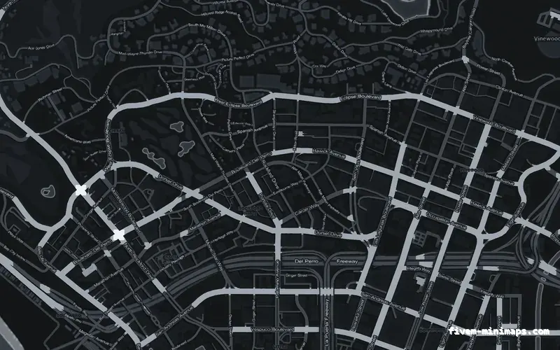
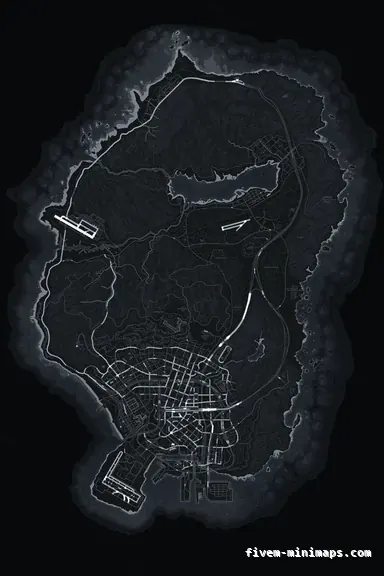
 No postals
GrayGRAPHITE
The safest palette there is: nothing on the HUD can clash with it.
6144 × 9216 px · 78 files · without postal codes$8.00+ $1 / elementView
Colour is the first thing anyone decides about a minimap and the decision most often made backwards — brand colour first, legibility afterwards. It is worth doing the other way round, because half the colours on a finished minimap are not yours to choose at all. The blips, the GPS route and the waypoint are drawn by the game in fixed colours over whatever you install, and your palette has to live underneath them.
Three concrete recommendations rather than a shrug — with the reason attached.
No postalsThe safest palette there is: nothing on the HUD can clash with it.
6144 × 9216 px · 78 files · without postal codes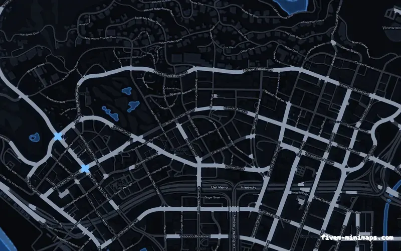
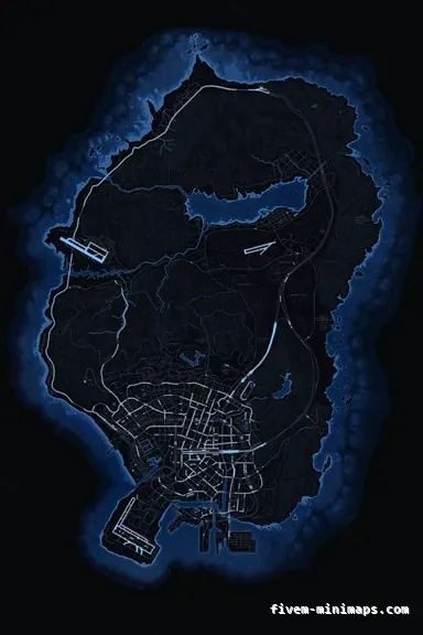 No postals
Strong identity with no common alert colour anywhere near it.
6144 × 9216 px · 78 files · without postal codes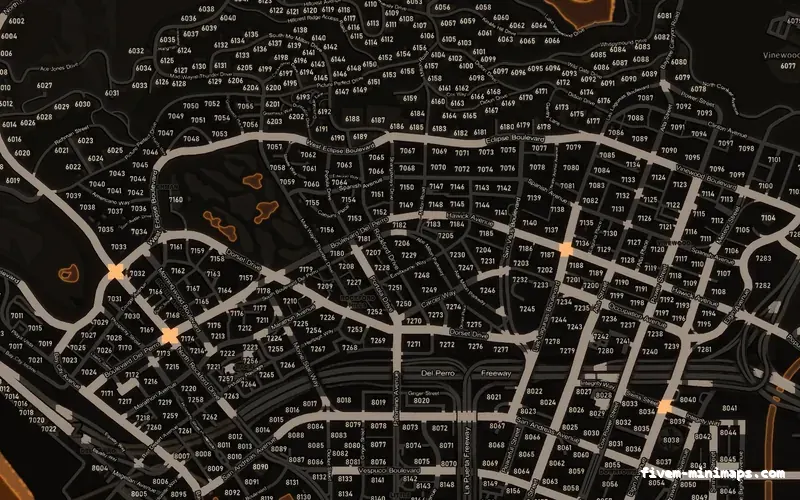
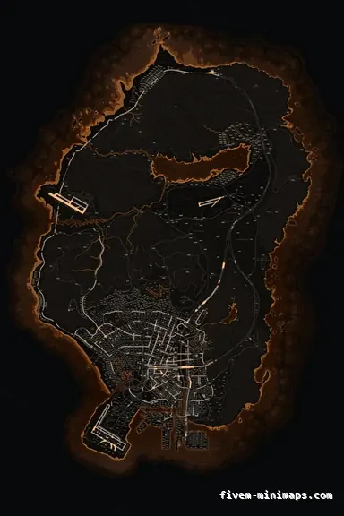 Postal codes
Warm and distinctive, and far enough from red to keep alerts separate.
6144 × 9216 px · 78 files · with postal codesThe ground, the water, the three road tiers, the coastline, the terrain shading, and the colour of any names or numbers printed into the art. That is the whole list, and it is the bottom layer of everything the player sees in that corner of the screen.
It does not control the blips, the GPS route line, the waypoint marker, the player arrow, the health and armour rings or the street-name bar. Those are the game and your HUD, drawn over the map in colours a texture cannot influence. Some HUD colours can be swapped from Lua, but that is a HUD job in a HUD resource — not something a map pack does or should do.
So the useful question is not "what colour do I want". It is "what colour still works with a bright route line, a dozen saturated icons, and whatever colour my HUD already is".
Every palette here works the same way. The ground is low contrast, the water is a related but clearly separate value, and the accent colour is spent almost entirely on the motorway tier. That is deliberate: the motorways are what you navigate by at a glance, so the one strongly coloured thing on the map is also the most useful thing on it.
It also means a coloured map does not read as a coloured screen. A player sees a dark map with a bright road network rather than a wash of your brand colour, which is what keeps a magenta or an emerald map usable instead of merely decorative.
This is a bigger decision than the hue. A dark map makes every blip and the route line pop, suits night-heavy servers, sits quietly under a bright HUD, and is where most roleplay servers end up. A light map is easier to read type on, holds more visible detail at pause-map zoom, and looks better in daylight screenshots.
The cost of light is glare and HUD collisions. White HUD text over the alabaster map disappears, and a light map at two in the morning on a dark server is a bright rectangle in the corner of the screen. The cost of dark is that fine type and terrain detail have less room to separate themselves from the ground.
If the server has no strong position either way, take graphite. It is the one palette nobody has had to re-buy.
Red is the most requested and the most expensive. The game uses red for a lot of alert states, several common dispatch scripts use it for active calls, and a red map means all of that is being drawn on red. It works, but only if the ground stays dark and the accent stays on the motorways — which is how the crimson palette is built, and why it survives where a home-made red filter over a stock map does not.
Green has the same problem with job and shop blips on most frameworks. Yellow can collide with the route line depending on your HUD. None of this is disqualifying, and all of it is worth ten seconds of thought before you buy rather than after.
The other consideration is players who cannot separate red from green, which is a meaningful slice of any server. A map that carries its hierarchy in brightness rather than hue stays usable for them — that is how the road tiers here are stepped, and it is a good reason not to rely on colour alone for anything you add on top.
Pick the palette closest to your Discord accent rather than trying to reproduce it exactly. A map is not a logo and nobody holds them side by side; what a player registers is "this server is the purple one", and violet does that job whether or not it matches a hex value.
If the colour has to be exact, put it in the elements instead. Your logo and your server name are rendered at whatever colours you give them, so the precise brand colour can live in the wordmark over the ocean while the map carries the closest palette underneath. That arrangement also ages best: a rebrand then costs $1.00 an element rather than a new map.
Open the live preview and look at any street on any theme before you spend a cent.