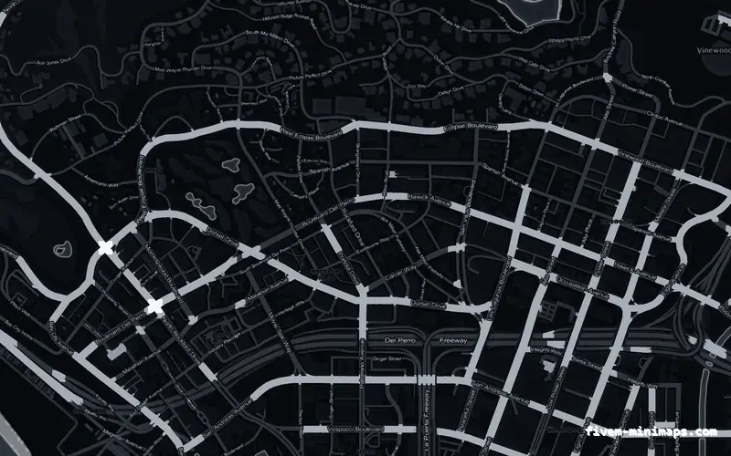
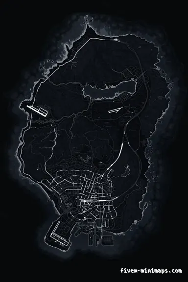
 No postals — Black
BlackOBSIDIAN
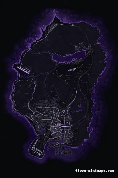
The darkest map we make, and still fully readable.
6144 × 9216 px · 78 files · without postal codes$8.00+ $1 / elementView the Black no postals minimap
Turning a map dark is easy. Keeping it readable once it is dark is the hard part: drop the brightness far enough and the road network disappears, leave it too high and the whole thing glows behind the blips. Each dark theme here is graded separately rather than filtered, so the water, the terrain, the three road tiers and the labels all keep their own separation.
Three concrete recommendations rather than a shrug — with the reason attached.
No postals — BlackThe darkest map we make, and still fully readable.
6144 × 9216 px · 78 files · without postal codes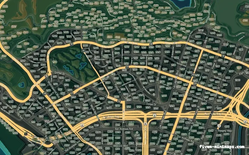
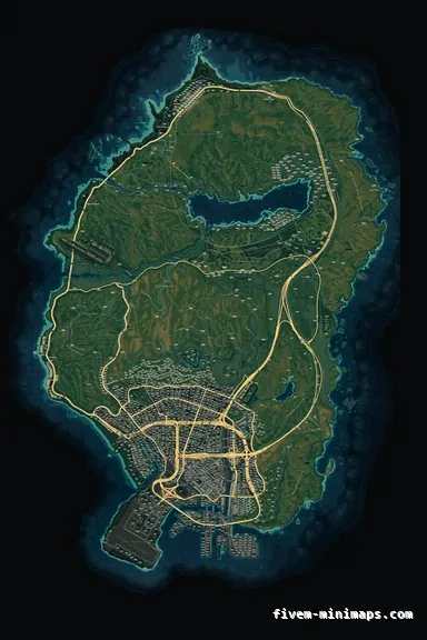 Google style — Mixed dark
Dark terrain with colour-coded roads and real relief.
6144 × 9216 px · 78 files · google style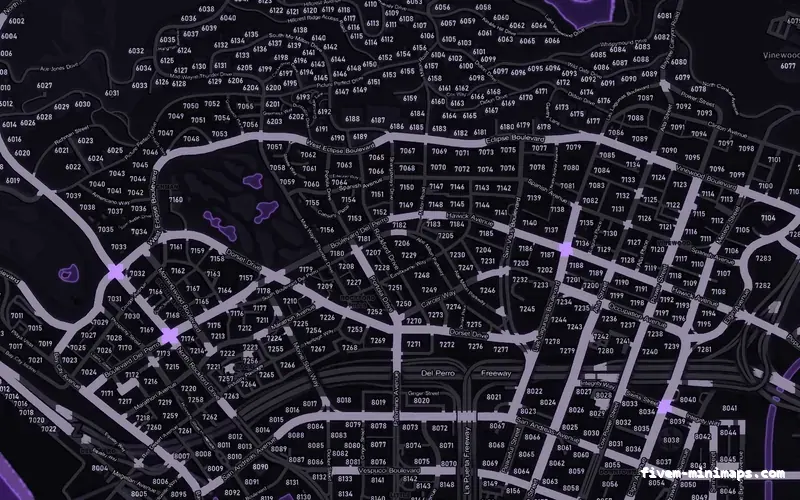
 Postal codes — Purple
Dark with a colour identity, postal numbers included.
6144 × 9216 px · 78 files · with postal codesA brightness filter applied to a finished map crushes everything by the same amount, which is why most dark maps lose their side streets. Ours are rendered from semantic layers — water depth, coastline, terrain, three road tiers and labels — so each one can be placed independently on the tone curve.
The radar shows a few hundred pixels of map at a time, often behind a translucent HUD. The test that matters is whether you can tell a freeway from an avenue from a residential street in a quarter of a second, at that size, on a bright screen and on a dim one. Every dark theme here was tuned against that, not against how it looks zoomed in on a screenshot.
Black, Grey, Mixed dark, Blue, Purple and Red all sit in the dark half of the collection. Each of them exists on all three base map styles, so you can pick the mood and the information density separately.
Open the live preview and look at any street on any theme before you spend a cent.