 Google style
Mixed lightTOPO DAY
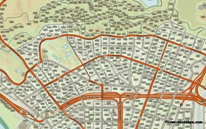
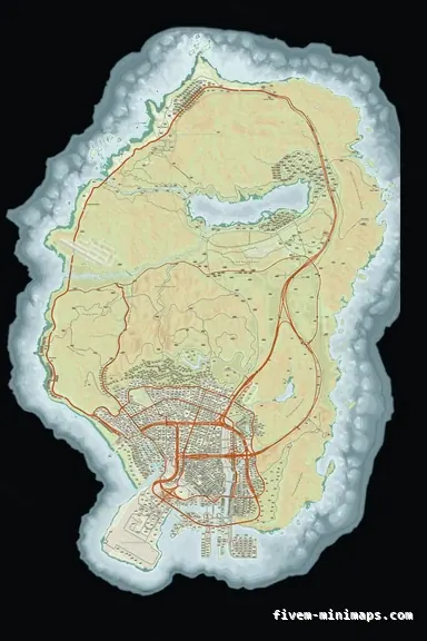
The nearest thing here to satellite: colour terrain, relief and a real street map.
6144 × 9216 px · 78 files · google style$8.00+ $1 / elementView
Satellite maps are the most downloaded minimap replacement in FiveM, and for good reason: aerial imagery of San Andreas looks spectacular the first time you open the pause map. What almost nobody mentions is what happens at radar size, at speed, in a car, at night. This page is the comparison nobody selling a satellite pack will write for you, and it ends with what we actually sell instead.
Three concrete recommendations rather than a shrug — with the reason attached.
Google styleThe nearest thing here to satellite: colour terrain, relief and a real street map.
6144 × 9216 px · 78 files · google style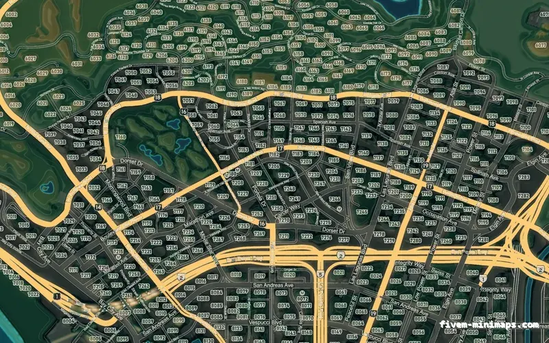
 Google style
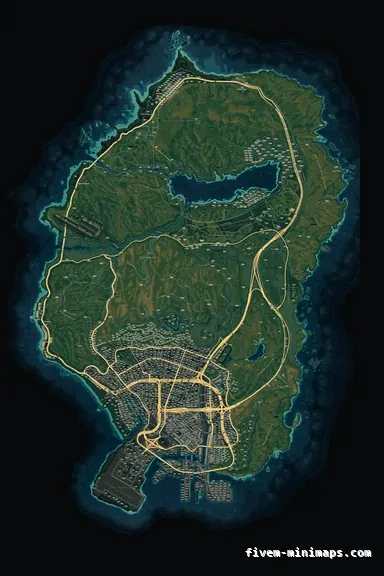
The same idea at night — hypsometric terrain that still reads at radar size.
6144 × 9216 px · 78 files · google style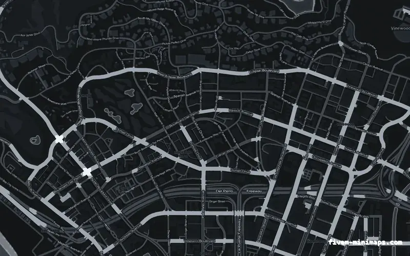
 No postals
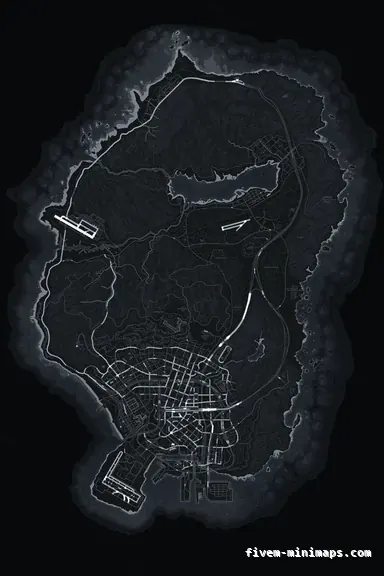
The opposite answer: maximum legibility, zero photographic noise.
6144 × 9216 px · 78 files · without postal codesScale and recognition. A photographic map tells a player instantly that the thing they are looking at is a marina, a quarry, a golf course — no legend needed. On the pause map, zoomed out, it is genuinely beautiful, and for a server whose identity is realism it fits.
It also needs no explanation to a new player. Nobody has to learn what a colour means.
A radar is about eighteen millimetres across on a 1080p screen. At that size an aerial photo is texture noise: rooftops, trees and car parks all land in the same mid-grey, and the one thing you need — which of those grey lines is a road you can drive down — is the hardest thing to pick out. A drawn map solves that by lying usefully: it widens the roads, darkens the blocks and throws away everything that is not navigation.
Photographic maps also compress badly. The minimap is stored as block-compressed texture, and block compression is built for smooth gradients, not foliage. The same file size buys a drawn map far more apparent sharpness than a photographic one, which is why satellite packs so often look blocky in motion even at high resolution.
And they are hard to brand. A logo on an aerial photo looks like a sticker. A logo on a drawn map can be given the same palette and become part of the cartography.
The Google-style base here is not aerial imagery and does not pretend to be. It is a full-colour street map — vegetation, sand, water depth, built-up ground — with genuine terrain shading behind it, so the hills read as hills and the coast reads as coast. It keeps the "this looks like a real place" quality that makes people want satellite, and keeps the road hierarchy that makes a map usable at speed.
Two of the twelve palettes go further and colour the land by elevation: a topographic day map and a topographic night map, both with contour lines on the land and bathymetric lines in the sea.
Use it, and pair it with a postal HUD rather than baked numbers — white text over a photograph needs a heavy outline to stay readable, and the outline is what makes most satellite postal packs look untidy. Check the file it ships as: a full mip chain matters more on photographic art than on drawn art, because without one the radar shimmers the instant the player moves.
And check for baked labels. Most public satellite packs carry district names and postal numbers burned into the image, which you cannot remove later without repainting that part of the map.
Open the live preview and look at any street on any theme before you spend a cent.