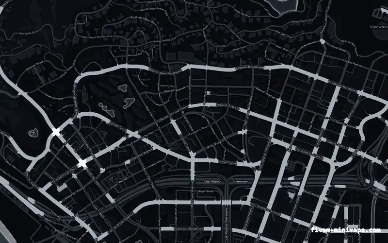
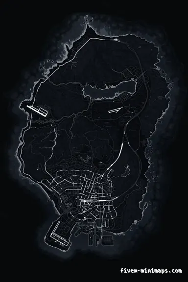
 No postals
BlackOBSIDIAN
The safest first impression — clean, considered, nothing to clash with.
6144 × 9216 px · 78 files · without postal codes$8.00+ $1 / elementView
A player who found you on the server list gives you about ninety seconds. They are not evaluating your economy scripts or your custom jobs, because they have not seen either. They are making a snap judgement from four or five surfaces, and most servers get two of them right and leave the rest as whatever the base build shipped with. This page is about the ones that actually get looked at, in the order a new player meets them.
Three concrete recommendations rather than a shrug — with the reason attached.
No postalsThe safest first impression — clean, considered, nothing to clash with.
6144 × 9216 px · 78 files · without postal codes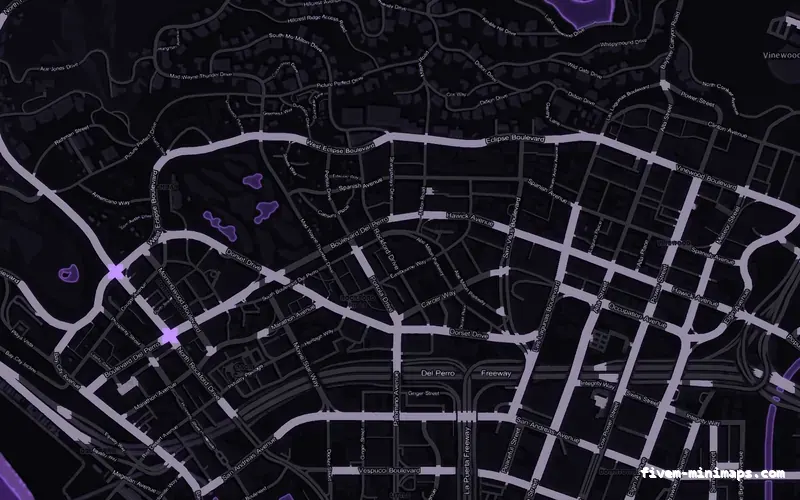
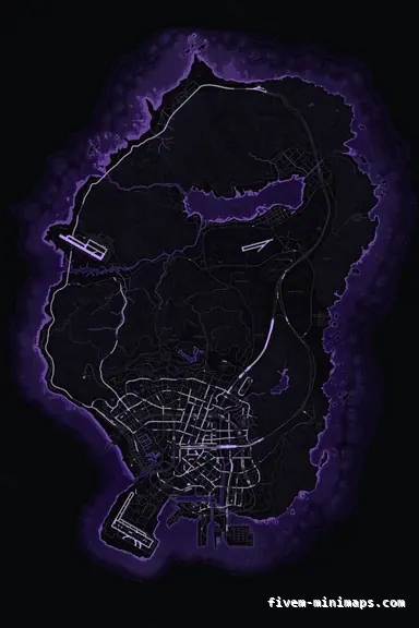 No postals
If the server already has a colour, let the map say so from the first frame.
6144 × 9216 px · 78 files · without postal codes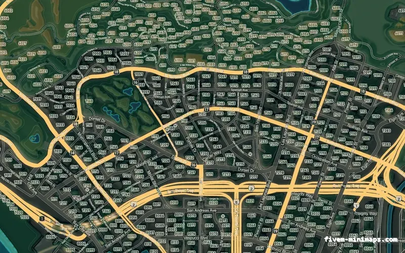
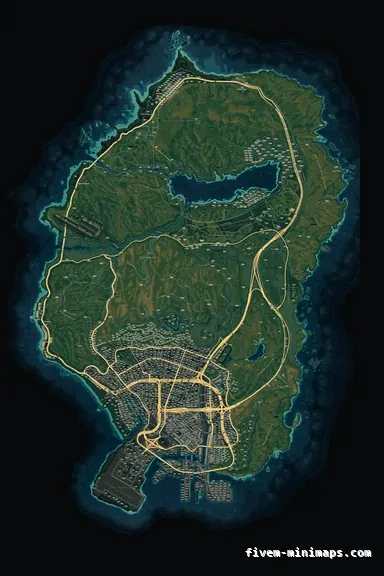 Google style
The map that most obviously is not the one every other server is running.
6144 × 9216 px · 78 files · google styleThe server list entry, then the loading screen, then a character or spawn screen, then the world, then the HUD. Every one of those is a chance to look like a server somebody built rather than a server somebody downloaded, and the cost of each is wildly different.
The loading screen and the server name get the most attention from owners and the least from players, because a player looking for somewhere to spend their evening reads the loading screen once and never again. The interface is the opposite: it is unremarkable at first glance and then it is in front of them for four hours.
Inconsistency, more than anything else. Five resources from five authors, each with its own colour, corner radius, font and notification style, is what makes a server feel assembled rather than made — and players register that long before they could articulate it. A server with a plain interface that is consistent looks more professional than one with five ambitious interfaces that disagree.
The second is anything recognisable from somewhere else. Players who have been on a dozen servers can identify a stock HUD, a widely shared map pack and a default loading screen at a glance, and each one they spot lowers the estimate of how much anyone here cares.
The third is friction: a spawn that drops you into a wall, a HUD covering half the screen, a tutorial that will not close. These get forgiven on a server that looks considered and end the session on one that does not.
It is the highest-frequency surface you own. A player looks at the minimap hundreds of times in a session, never opens your settings menu, and will look at the loading screen exactly once. It is also the one piece of interface that is present in every screenshot and every clip, which means it is doing identity work whether you chose it or not.
And it is unusually cheap to fix, because it is art rather than code: no integration, no conflict with your framework, no ongoing maintenance. That combination — most seen, least work — is why it is worth doing early rather than after the third HUD rewrite.
The mistake in the other direction is branding too hard. A logo across the middle of the map, a heavy watermark on the radar or a palette that fights every blip reads as a server advertising to people who already joined. Identity should be obvious and quiet.
Do this from a second account, with the client cache cleared, at the time of day your server is actually busy. Owners test on a machine that has everything cached and a character that already exists, which is the one experience no new player has.
Make the things you already have agree with each other. Pick one accent colour and force every resource you can configure onto it. Remove the resources you are not using, because each one adds notifications, blips and keybinds to a player who has to learn all of them. Then fix the spawn.
After that, the map is the cheapest visible change there is — $8.00, or free if you are the tenth account to register, and it changes the piece of screen with the highest view count on the server.
Open the live preview and look at any street on any theme before you spend a cent.