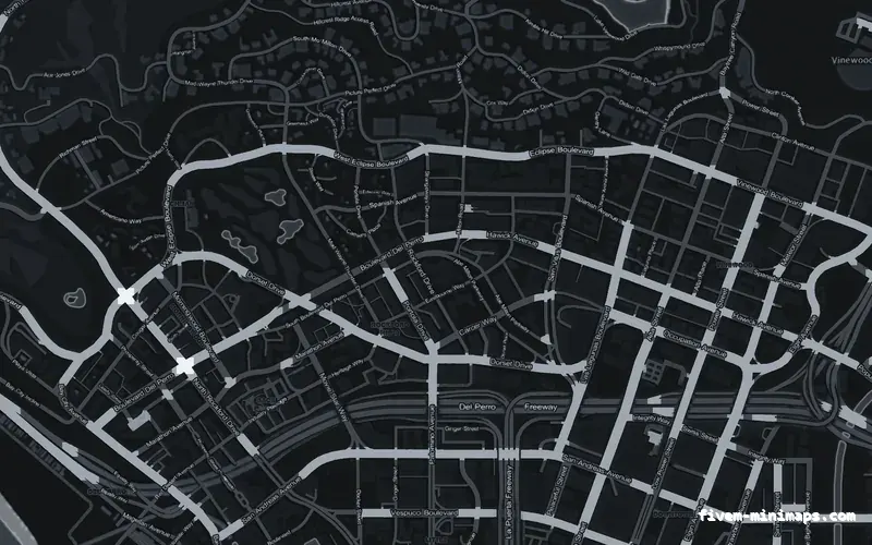
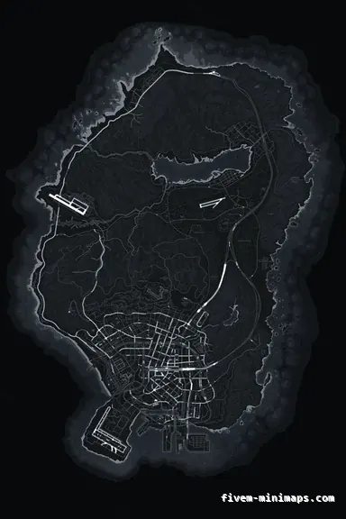
 No postals
GrayGRAPHITE
Neutral enough to sit under a coloured HUD without clashing.
6144 × 9216 px · 78 files · without postal codes$8.00+ $1 / elementView
Almost every question that starts "can I change my minimap to…" is really two questions with two different answers. Some of it is the HUD — the frame, the shape, the position, the health and armour bars around it. The rest is the map — the art inside. Mixing them up is why people buy the wrong thing. This page draws the line, then explains how to pick a map that will not fight whatever frame you run.
Three concrete recommendations rather than a shrug — with the reason attached.
No postalsNeutral enough to sit under a coloured HUD without clashing.
6144 × 9216 px · 78 files · without postal codes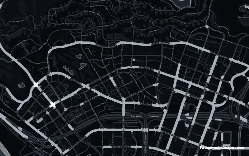
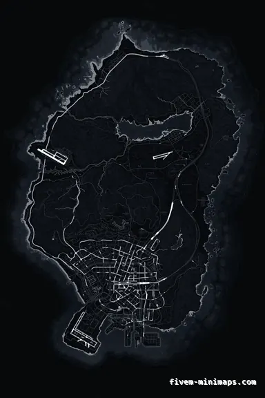 No postals
The safest base when the HUD already carries the server colour.
6144 × 9216 px · 78 files · without postal codes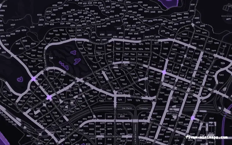
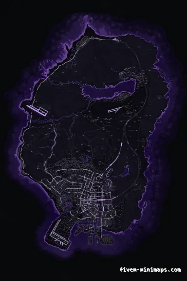 Postal codes
When the HUD is monochrome and you want the map to carry identity.
6144 × 9216 px · 78 files · with postal codesShape and size, position on screen, the frame or border, whether the health and armour bars hug it, the street-name bar under it, and any overlay you draw on top such as a nearest-postal readout or a compass. All of that lives in a HUD resource and none of it is texture.
Everything inside the frame. The colour of the land, the water and the roads; whether postal numbers and street names are drawn into the art; how the terrain is shaded; and what your logo looks like sitting on it. This is the part you cannot change from Lua at runtime, because it is streamed art.
It also controls the pause-menu map, since both read the same tiles. A HUD resource cannot restyle the pause map; a texture pack restyles both at once.
Pick one of them to carry the colour. If your HUD frame is a strong brand colour, use a neutral map — graphite or black — and let the frame do the talking. If your HUD is monochrome, take a coloured map and let the map be the identity. Two saturated colours around one small circle is the most common way a good HUD and a good map end up looking bad together.
The second rule is contrast direction. A light HUD over a dark map reads well; a light HUD over the alabaster daylight map does not, because the frame disappears into the ground.
A square frame shows noticeably more map for the same screen area, which is why it has become the default on custom HUDs. It is also less forgiving: the corners expose more of the map at once, so a noisy texture that got away with it inside a circle stops getting away with it. Flat, drawn maps suit square frames particularly well.
Open the live preview and look at any street on any theme before you spend a cent.