Brand the minimap with your own logo and text
A branded minimap is one of the few pieces of server identity a player sees constantly without being interrupted by it. Done well it reads as part of the map; done badly it is a watermark sitting on top of the thing people are trying to read.
Short answer: Put branding in the ocean, not over the city. Keep it under about 8% of the map width, match the palette rather than fighting it, and check it at radar scale before committing.
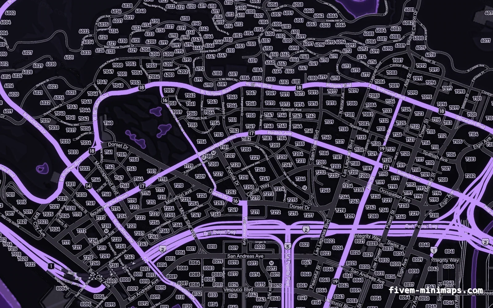
#Where branding actually works
The map has large areas that carry no navigational information: the ocean south and west of the island, the top-left corner above Paleto, and the empty desert east of Sandy Shores. Those are the places branding belongs.
| Location | Verdict |
|---|---|
| Ocean, south-west | Best. Large, empty, always visible on the pause map. |
| Above Paleto, top-left | Good. Empty, and rarely in the radar view. |
| East of Sandy Shores | Good for a second, smaller mark. |
| Over Los Santos | Bad. This is the densest, most-read part of the map. |
| Centre of the island | Bad. It sits under the player blip constantly. |
#Size and legibility
The map is 6144 pixels wide. A logo at 500 pixels wide is about 8% of the map, which on the pause map reads clearly and never dominates. Twice that starts to feel like an advert.
Text has a harder floor: below roughly 90 pixels of cap height, letters start to break up when the game compresses the texture, and thin typefaces break up sooner than heavy ones.
- Server name: 300–600 px wide is the usable range.
- A tagline under it: about half the height of the name.
- A Discord invite: keep it short. A full URL at legible size is wider than most people expect.
- Heavy, condensed typefaces survive compression far better than light ones.
#Contrast without shouting
The most common mistake is pure white text on a dark map. It out-contrasts the roads, which means the eye goes to the logo instead of the map every time the player opens it.
Pick a tone from the palette itself — the coastline colour is usually right — and let the branding sit at the same brightness as the major roads rather than above them.
#Logos: what survives the compression
- Flat shapes with clear silhouettes survive. Gradients, thin strokes and small text inside a logo do not.
- Upload at least 1000 px on the long edge. The studio renders at 2× and downsamples, so a small source is visibly soft.
- PNG with real transparency, not a white box. A logo on a white rectangle over a dark map looks like a mistake.
- If your logo has a light and a dark version, use the one that contrasts least with the map, not most.
#Working in the studio
Pricing is per element: the map is $8.00 and every text or image you place is $1.00. A server name, a tagline and a logo is three elements — $11.00 in total.
- 01 Pick the map first
Base map style, then palette. Branding decisions depend on the palette, so do not do them in the other order.
- 02 Place in the ocean
Drag your text or logo into the empty water. The grid snaps to the centre lines and to other layers.
- 03 Check at radar scale
Zoom the preview all the way in. If the branding is unreadable there, that is fine — it is meant for the pause map. If it is in the way there, move it.
- 04 Match the palette
Use the coastline colour as your accent instead of white.
- 05 Download
The finished resource is built after payment and installs exactly like any other map.
#What not to do
- Do not put the branding over the city. It is the part of the map people read.
- Do not use a full URL in large text. A short name works; a URL is clutter.
- Do not add a semi-transparent tint over the whole map. It flattens the road hierarchy the render worked to separate.
- Do not repeat the logo. One mark, placed well, is more convincing than four.
- Do not use pure white or pure black. Both fight the palette.
Questions
How much does branding cost?
Can I change the branding after buying?
What image formats can I upload?
Will my logo be readable on the radar?
Ready to pick a map?
Twelve themes on three base map styles, $8 each, instant download.
Relevant to what you just read
Look it up while you work
The reference tables this guide leans on, free and without an account.
- The 100 blip colour indexesEvery index SetBlipColour accepts, with the hex value the radar actually draws.